Traditional shopping carts don’t have much to improve upon. Sure, big box stores can add a more comfortable seat for children, or smoother wheels, or more space. But the base mechanics remain pretty simple: fill a container with stuff, pay for it, wheel it to your car and then take it home.
eCommerce shopping carts are something else entirely.
For a shopper to successfully buy from your site, they need to first find the products they’re looking for, then select them in the right type and quantity, and then navigate a checkout process where they add their payment and shipping information.
Your eCommerce shopping cart is the backbone of that entire journey.
It’s where customers save their items during their shopping, and it’s where they click—after a few decades of being conditioned to look for it in the upper right corner, after Amazon put theirs there—when they’re done looking around.
It’s also where many eCommerce sellers lose business. Upwards of 70% of shoppers abandon their shopping cart before checking out, per UX research firm Baymard Institute . In this article, we explore why—and what you can do about it.
Top 5 Reasons Customers Abandon Carts On eCommerce Websites
A 70% shopping cart abandonment rate seems high. But remember that eCommerce doesn’t offer the same window-shopping options as traditional retail does, so many users will be comparison shopping, making wishlists, and simply browsing while using the cart feature.
Still, there are several common reasons for abandonment, and Baymard surveyed over 4,000 shoppers and found that abandonments that weren’t due to shoppers just browsing were caused by:
Too-high costs. 49% of non-browsing cart abandonments were because shoppers found shipping, taxes, or other fees to be too high.
Having to create an account. 24% of shoppers left because they didn’t want to sign up for a store’s account program.
Too-slow delivery. 19% of buyers clicked out of their cart when they found out when they’d get their purchases and thought it was too late.
Overly complicated checkout process. 18% of shoppers were turned off by too many steps at checkout.
Not trusting the site with credit card information. 17% of buyers didn’t trust that their personal financial information would be protected.
11 Best Practices For Your eCommerce Shopping Cart Design
To avoid losing customers through cart abandonment, you’ll want to design your ecommerce shopping cart and checkout process in line with these best practices:
1. Give shoppers two useful cart experiences
A traditional shopping cart page will be full sized, providing a summary of everything a shopper is about to buy. This lets customers make sure that they’ve got everything they need before clicking through to checkout.
Example: Superga
A mini cart that pops up and live-updates as customers add things to their cart can enrich the shopping experience, giving them a simplified shortcut view that can be referenced from any page in your ecommerce store.
Example: Superga
2. Display all relevant shipping options
To make sure you capture customers who are browsing, as well as those who are planning on making an online purchase and shipping it to their home, you’ll want to offer multiple shipping options—and make sure they’re easily findable.
Make sure your cart options show what’s in-store, if you have retail space; what can be picked up somewhere physical (whether a store or something like an Amazon Locker); and what can be shipped (along with how long it will take).
Example: Bed Bath and Beyond
Take a look at what the home goods giant offers: free store pickup at a local store, as well as shipping options that include the estimated deliverable date.
3. Ensure customers can see how many items are in their shopping cart
Make sure you’re designing a useful, simple display to help your customers keep track of how many items they have in their cart. This can help prevent accidental purchases (and thus additional returns and customer service requests).
Example: Tokyo 2020 Online Shop
Looking to buy Olympic gear? The online shop for the Olympic Games tells shoppers clearly and cleanly, with a constantly-updated red circle integrated with their shopping cart, how many items they have in their cart.
4. Allow customers to easily adjust the quantity of items from their cart
Letting customers adjust the number of any given item from the cart page directly, versus making them return to the actual item page to add more, can make it easier for shoppers to buy more (or, when necessary, remove items) from the same page.
Example: Minted
Bonus points to Minted for including pricing updates alongside quantity updates. This page could be improved, though, by having a “0” option in the quantity bar for shoppers who changed their mind (though they do have the “remove” button above the product details).
5. Make cross-selling products a part of your ecommerce cart design
Optimizing your ecommerce cart is all about improving your sales. Why not go a step further and help customers as well as your sales numbers by suggesting additional items that go along with what’s already in their cart? Try the same thing with upselling, too.
Example: B&H
After a customer has added a camera to their cart, B&H serves them related items, from memory cards (helpfully labeled “essential,” as the camera really won’t hold much without one) to rechargeable batteries.
6. Provide trust seals to ensure your customers that their identity and purchase information is secure
While most customers will have plenty of experience sharing their credit card information on the internet, it never hurts to reassure customers that your checkout process is a secure one. (Especially with headlines about class action settlements won against ecomm companies who didn’t secure their customers’ data!)
Example: Asos
See the digicert logo in the upper righthand corner of the checkout window? It assures customers that their name, address, email, and credit card information will be protected.
7. Allow for guest checkout
Not every buyer is going to want to sign up with an official account on your website in order to complete one order, and you run the risk of losing their business entirely if you force them to do so. Make sure you offer a guest checkout option for customers in a hurry.
Example: Warby Parker
While the vision giant probably wants customers to sign up and stay loyal, they’re happy to give buyers a guest checkout option to keep things moving.
8. Offer a mobile-friendly cart experience and include popular digital wallets
50% of 2022’s eCommerce will take place on mobile phones, reports Forbes . If your site isn’t designed for mobile already, it’s time to make sure it is now. Integrations like Shop Pay can keep mobile-first checkout experiences streamlined and easy, and adding digital wallets like ApplePay and GooglePay, among others, will make it simple for customers to buy from their phones.
Example: Lumecube
Purchasing a ring light from Lumecube is just as easy on mobile as it is via a web browser, with clear steps and multiple payment options available in each place.
9. Offer gift wrapping and make it easy to find
Buyers who are shopping for someone else want to make sure that their purchase can be successfully delivered as a gift. Including gift wrapping options early on in the checkout process, and making them obvious, can make your site a favorite for gift shoppers.
Example: West Elm
West Elm has packaged their gift options along with their delivery options, and has even included helpful guidance on whether pricing will be shown—it won’t—so that gift buyers have everything they need for a successful purchase.
10. Include a clear order summary
Shoppers will often double check that what they’ve put in their cart is exactly what they need, which can mean reviewing sizing, quantity, price, shipping information, or store policies like return and exchange policies. Make it easy on them by including that context in an easy-to-skim summary page.
Example: Sur La Table
Right before checking out, a Sur La Table shopper is served with this little box that clarifies the size, name, shipping time, and cancelation options for their chosen product(s), improving the chances that the customer doesn’t have to navigate away from checkout to double-check anything.
11. Put a timer on carts
As we talked about above, some customers are just browsing, and you’re unlikely to convince those that they need to purchase something right now. But some customers can be swayed with a little time crunch, and adding a clear timer to your cart that lets customers know how long you’ll hold their selections can help nudge them in the direction of checkout.
Example: Asos
This cart timer is plenty long enough, at an hour, and updates as the shopper continues to look for items, so that they always know how much time is left before they need to complete checkout.
Learn More About Optimizing Your eCommerce Checkout Process With Clyde
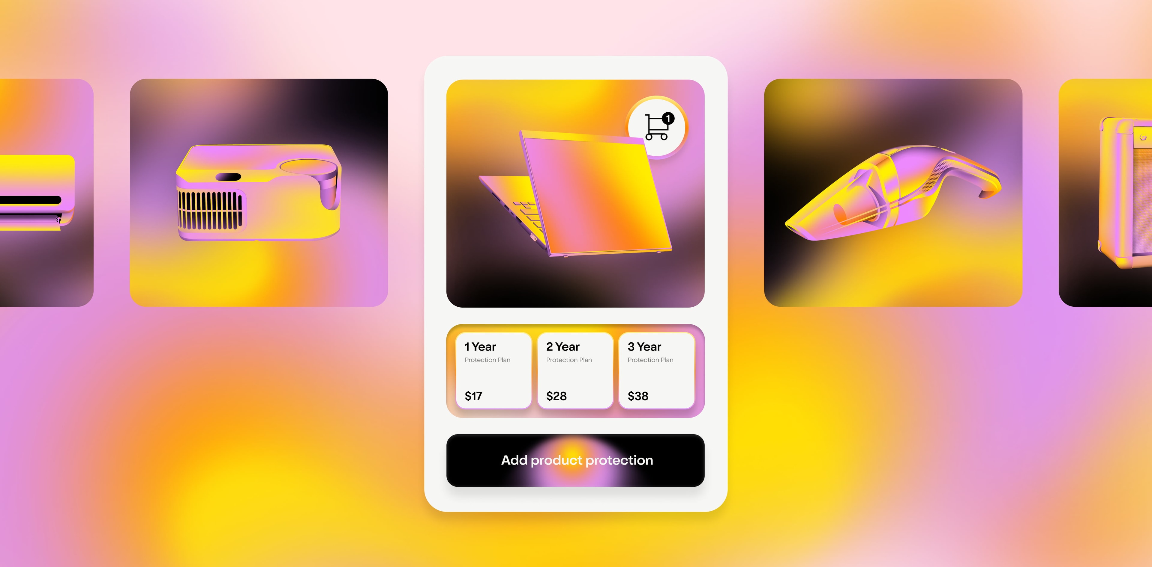
This article has focused mostly on ways that you can optimize your shopping cart experience with layout and UI. But you can also think about offering additional products or services that level up your customer experience and also help increase your profit margins and AOV . That’s where Clyde comes in—we offer easy-to-set-up product protection that’s customizable to your business and that integrates directly with your checkout.
If you’re interested in giving your customers helpful protection options that increase customer satisfaction while also serving your bottom line, reach out and schedule a free Clyde demo today .
SIGN UP FOR OUR NEWSLETTER


